


900 Haddon Ave, Collingswood, NJ, 08108 Suite 424
Thank you! We got you!
Oops! Something went wrong. Try again!
.svg)
.svg)
.svg)
.svg)
Products
Products
Products
© 2025–2026 Black Pearl Group Ltd.


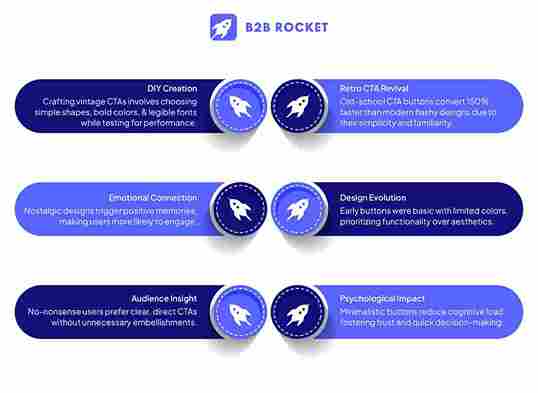
Imagine a digital battlefield: neon gradients duel with chatbots, while users flee screaming into the arms of a humble “Submit” button. Surprising? Not when retro CTAs—those unapologetic rectangles and underlined blue links—convert audiences 150% faster than their AI-powered counterparts.
In a world obsessed with “disruption,” the most rebellious act is simplicity. These buttons aren’t relics; they’re time machines.
For generations raised on clunky keyboards and screeching modems, that bold red “Buy Now” feels less like a sales pitch and more like muscle memory—a trusted handshake in a landscape of fist bumps.
In our journey ahead, we'll explore how these timeless CTAs capture the hearts of no-nonsense audiences and boost lead generation, proving that sometimes, stepping back in time is the best way forward.
Long before the era of sleek, responsive design, websites were simple, direct, and, yes, nostalgic. Early web pages featured buttons that were often basic in form—solid colors, minimal styling, and a focus on functionality rather than flair.
These early CTAs were designed to be unmistakable signals: “Click Here,” “Learn More,” or “Buy Now.” Their unambiguous nature was both a product of limited design tools and a clear emphasis on communication over aesthetics.

In the early days of the internet, designers worked with rudimentary tools and limited color palettes. HTML and basic CSS dictated design choices, resulting in buttons that were square or slightly rounded, often bordered by simple outlines. These buttons weren’t just elements on a page; they were calls to action that guided users through a digital frontier that was, by necessity, straightforward.
Technological limitations and slower internet speeds meant that websites had to load quickly and operate reliably. Designers focused on clarity and speed over complex aesthetics. The simplicity of these buttons made them easy to recognize and interact with, establishing a standard that many users still find reassuring today.
For many, these designs are reminiscent of the early days of the internet—a time when the digital world was less cluttered, and every click felt like a small adventure. This sense of nostalgia creates a unique connection, as users subconsciously associate these designs with reliability and an uncomplicated user experience.
As we look back at this digital time capsule, it becomes clear that the legacy of these early CTA buttons isn’t just about outdated design—it’s about the enduring principles of clarity, functionality, and user trust.
Why do old-school CTA buttons continue to be effective, even in an age of hyper-stylized web design? The answer lies in psychology. Simple designs tap into fundamental human preferences, making it easier for users to process information and take action.
Our brains naturally gravitate toward simplicity. A clean, straightforward button requires less cognitive load to process, meaning users can quickly understand its purpose without sifting through unnecessary visual clutter. This cognitive ease can be the difference between a user clicking through or getting distracted and moving on.
designs evoke a sense of familiarity. When users see an interface element that reminds them of the early internet—when things were more straightforward—they’re more likely to trust the design and, by extension, the website or brand.
A no-frills CTA button sends a clear message: “This is what you need to do next.” There’s no ambiguity or hidden agenda. This direct communication is particularly appealing to audiences that value efficiency and transparency, reducing friction in the decision-making process.
Nostalgia isn’t just a sentimental indulgence—it’s a powerful emotional tool. When users encounter design elements reminiscent of a simpler digital past, it can trigger warm, positive memories. This emotional response can lower barriers to action, making users more likely to engage with a CTA.
Research in behavioral psychology shows that simple, clear calls to action are more effective in converting users. By reducing distractions and emphasizing the essential message, these buttons can subtly guide users toward the desired action without overwhelming them with choices or clutter.
When you combine the science of cognitive processing with the emotional appeal of familiarity, you create a design element that works on multiple levels.
Vintage CTAs aren’t just relics of the past; they’re a blend of timeless design principles that continue to resonate with users today. Let’s break down the key elements that define a successful vintage CTA button.
1. Shape and Structure: Early CTA buttons often featured simple geometric shapes—rectangles with slightly rounded corners or even perfectly square forms. The emphasis was on clear boundaries and easily clickable areas. This simplicity in form helps reduce any ambiguity about the button’s purpose.
2. Color Palette: The color choices of vintage buttons were influenced by the limited palette available at the time. Designers often used bold, solid colors like blues, reds, or greens—colors that stood out against the background and caught the user’s eye. These hues not only provided contrast but also conveyed a sense of urgency and action.
3. Typography: In the days of early web design, typography was straightforward. Sans-serif fonts with clear, legible lettering were preferred for their readability, especially on lower-resolution screens. The lack of overly decorative fonts contributed to the button’s clarity, ensuring that the message was immediately apparent.
Each design element works together to create a button that’s instantly recognizable as a clickable element. Even without a detailed explanation, users know that this is where they’re supposed to interact.
By stripping away unnecessary embellishments, vintage CTAs focus solely on what matters: prompting the user to take action. This minimalism can be especially powerful in environments where users are bombarded with choices and distractions.
Despite the evolution of digital design, the principles that make a good button remain the same. Clear, direct communication, high contrast, and simple forms are as effective today as they were in the early days of the internet. In a way, these elements are evergreen—they adapt to the times without losing their core functionality.
Design is only as effective as its ability to communicate with its audience. For many brands, the target audience values straightforward, reliable, and unembellished communication. Let’s explore who these no-nonsense users are and why they might be drawn to nostalgic CTA designs.
Many users today are overwhelmed with information. In a world of endless notifications and complex digital interactions, a simple, direct CTA can feel like a breath of fresh air. These users appreciate when a design element tells them exactly what to do without any unnecessary frills.
Audiences that have grown up with digital media often have a keen sense for what feels genuine. Nostalgic designs can evoke memories of a simpler time, building an instant rapport. This familiarity can translate into trust—a crucial component when asking users to engage, subscribe, or make a purchase.
For users who value clarity, the old-school CTA’s direct messaging is a welcome change from overly complicated designs. They don’t want to guess what a button might do; they want an immediate, unambiguous call to action that speaks directly to them.
.jpg)
Ready to dive in and create your own vintage-inspired CTA button? Let’s break down the process into actionable steps that you can follow, regardless of your design expertise.
What is the primary action you want users to take? Whether it’s signing up for a newsletter, making a purchase, or downloading a resource, clarity in your goal will guide your design decisions.
Consider your brand’s values and voice. A nostalgic CTA should not feel out of place—it should be a natural extension of your overall identity.
Start with rough sketches or wireframes. Focus on the overall layout and placement of your button within your design. This brainstorming phase is all about capturing the essence of what you want to achieve.
Decide whether a rectangular button with soft, rounded edges or a square, more angular button better suits your brand’s personality. Keep in mind that simplicity is key.
Draw inspiration from classic web design. Bold, solid colors that contrast well with your background can evoke that vintage feel while remaining functional. Consider using colors that have a historical resonance in digital design, like muted blues or classic reds.
Choose a clean, legible font that conveys clarity. Avoid overly decorative fonts that could detract from the button’s message. The focus should be on readability and immediate comprehension.
While simplicity is your goal, don’t be afraid to include minor design flourishes that hint at the vintage aesthetic—perhaps a slight gradient or a subtle drop shadow. These details can enhance the overall appeal without overwhelming the design.
Use contemporary design software like Figma, Sketch, or Adobe XD to bring your concept to life. These tools offer the precision needed to create clean, functional designs that mimic the vintage aesthetic.
Once your button is live, test different versions to see which resonates best with your audience. Experiment with variations in color, shape, and size. Collect data on click-through rates and engagement to refine your design further.
Use the insights gained from testing to adjust your design. Remember, even a vintage look can benefit from modern optimization strategies. The goal is to maintain that nostalgic appeal while ensuring maximum effectiveness.
By breaking down the process into manageable steps, you can create a nostalgic CTA that not only looks great but also drives real user engagement.
At our B2B Rocket, we’re passionate about turning your DIY vintage CTAs into modern conversion powerhouses. Our AI agents work seamlessly with your creative designs, transforming every click into a valuable lead. Experience firsthand how merging old-school charm with our advanced technology can redefine your digital engagement strategy.
While vintage CTAs offer a refreshing return to simplicity, the digital landscape today demands functionality and innovation. The key is to merge the best of both worlds—harnessing the nostalgic charm of old-school design while integrating modern usability standards.

Modern users access websites on a variety of devices—from desktop monitors to smartphones. Ensure that your vintage CTA adapts seamlessly across all platforms. Responsive design principles mean that your button should maintain its clarity and functionality, regardless of screen size.
While simplicity is crucial, subtle modern touches can enhance user experience. Consider adding a gentle hover effect or a brief animation that confirms a user’s action without detracting from the vintage feel. These micro-interactions provide essential feedback and can improve conversion rates.
By thoughtfully merging retro aesthetics with contemporary design principles, you can create a CTA that stands out—not just for its nostalgic charm, but for its effectiveness in driving user action.
In a digital age cluttered with complexity, vintage CTAs thrive by marrying nostalgia with functionality. Their simplicity cuts through noise, offering instant clarity to audiences weary of over designed interfaces.
Bold colors, straightforward text, and familiar shapes tap into cognitive ease and emotional trust—proving that timeless design principles still drive modern conversions.
For no-nonsense audiences, these buttons aren’t relics; they’re reassurance.Ready to blend retro charm with razor-sharp results? Let our B2B Rocket elevate your CTAs into conversion engines. Transform clicks into pipelines with strategies rooted in simplicity.